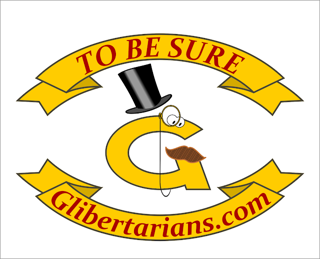
My logo submissions for Glibertarians.com, I lost out to the love child of Mr Peanut and Milburn Pennybags.
 |
First attempt
|
 |
| Cleaner G with top hat |
 |
| Please ignore the missing a |
 |
| Industrial strength freedom lube |
 |
| Seizure barrel |
 |
| Too busy for a logo sure, but how can you top a sword wielding squirrel riding a laser eyed eagle carrying a rattlesnake with a Lee Marvin scale pattern? |
and unfortunately there was this.
 |
| Yes, It's awful. I was trying to design in Inkscape and as you can see designing is better done on paper, at least for me. |
No comments:
Post a Comment